
Product Packaging & Visual Systems
Translating Product Positioning into a Scalable Visual Language
Dieline / Print Spec / Brand System / Cross-SKU Consistency / Cross-functional Collaboration
Project details
A multi-year body of packaging and visual system work spanning Edge AI surveillance products (Tranwo AC-110 series) and medical devices (Maisense FREESCAN). The scope covered dieline structure design, print specification, multilingual layout systems, and brand-level visual language — delivered alongside production-ready files and material part numbers for procurement.
Role
Packaging & Graphic Designer
Status
Shipped & in production
Year
2017 — 2026
Context
Hardware products live or die at two moments — the moment a buyer picks up the box on a shelf, and the moment a user opens it at home. Packaging is not decoration; it is the first and last UI a product ever has.
Across Edge AI cameras, embedded monitors, and personal cardiovascular devices, the recurring challenge was the same: how to translate a complex technical product into a visual language that a non-technical buyer can understand in under three seconds, while still meeting the practical demands of dieline structure, print production, and multilingual regulatory content.
The work covered four parallel tracks: product positioning & visual language / dieline & print engineering / cross-SKU system scalability / cross-functional alignment with PM, procurement, and print vendors.
From positioning to visual language
Before any layout decision, each product line was unpacked into three positioning anchors: who buys it, what single benefit they remember, and what category cue tells them this is the right product on the shelf.
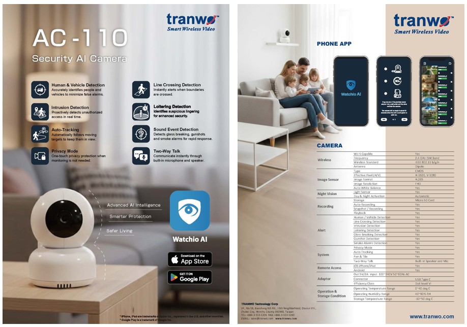
For AC-110, the anchor was "AI that understands events, not just records them" — so the visual hierarchy on the Color Box prioritized detection scenarios (human / vehicle / sound events) over hardware specs. For Maisense FREESCAN, the anchor was "clinical-grade in a personal form factor" — so the layout balanced medical authority (certifications, ECG visuals) with consumer reassurance (lifestyle imagery, plain-language benefits).
Positioning was translated into a small set of repeatable decisions: a primary benefit zone on the front panel, an icon-led feature strip, a certification & spec band, and a consistent placement for product name, model, and barcode. Once that grammar was set, every subsequent SKU could be designed against the same skeleton instead of from scratch.
Dieline structure & print engineering
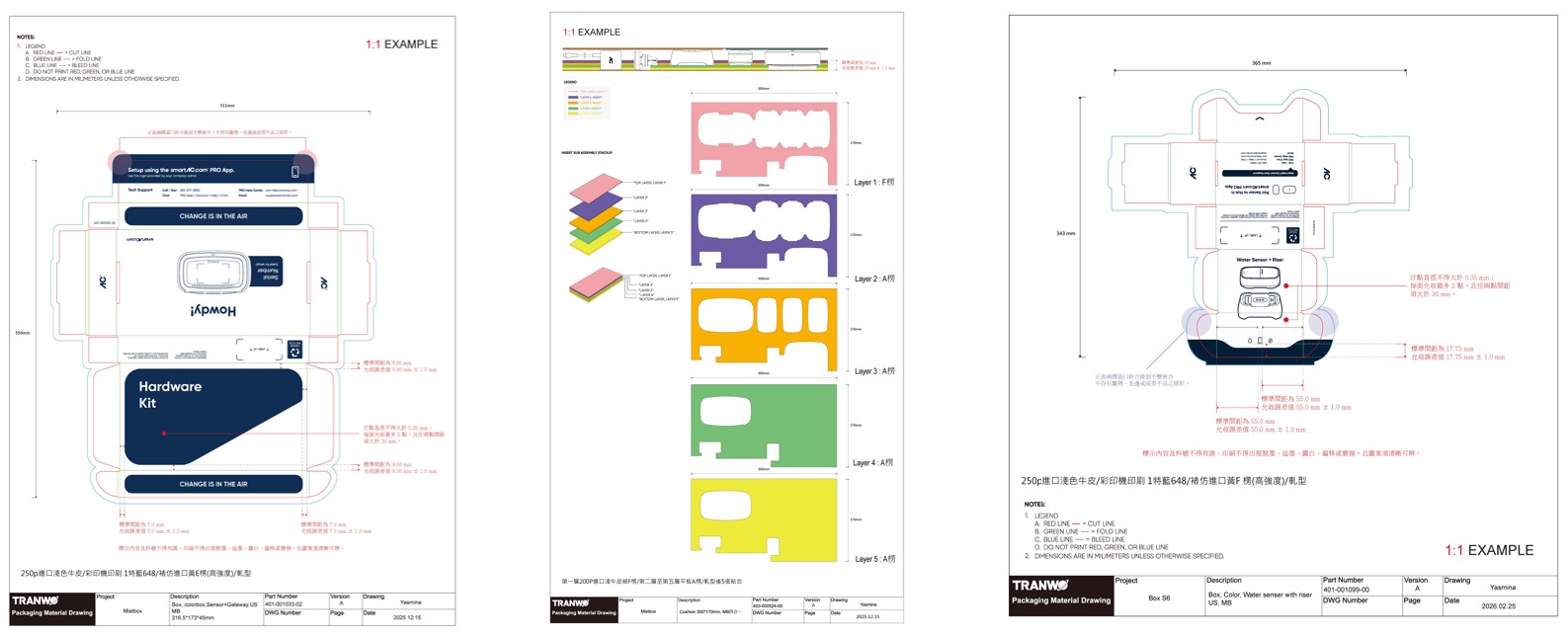
Every packaging deliverable shipped as a production-ready file — not a render. That meant the dieline carried more than graphics: cut line / fold line / bleed line were color-coded (red / green / blue) with explicit notes that those lines must never print, and every dimension was annotated in millimeters at 1:1 scale.
For the AC-110 Color Box, the structure was a 250p imported white kraft, 4-color front + 1-color black back, with water-based varnish and matte-finish lamination, scored and die-cut in a single pass. For the cushion insert, a 5-layer color-coded assembly stack (F-flute outer + A-flute inner layers) was designed so the assembly line could verify orientation visually — wrong layer order is immediately visible because the colors don't match.
Stickers and addendums followed the same discipline: a 75×20mm rating label on 50# silver release paper with a PET liner; a 285×202mm addendum on 370P high-white smooth card, printed 4-color front and 1-color back. Each file shipped with a Tranwo Packaging Material Drawing sheet carrying part number, version, DWG number, and drawing date — the artifact procurement actually files.
Trade-off:
The original Color Box concept used a 5-color print (4C + spot Pantone for brand accent) to lock the brand color across print runs. Procurement flagged the cost premium and minimum order quantity risk for a product still ramping volume. The decision was to drop the spot color, restrict the brand accent to a single high-coverage zone where 4C reproduction was acceptable, and document the Pantone reference in the spec for future re-runs once volume justified it.
Scalability across SKUs & languages
One product is a poster. Five products is a system. The visual system had to absorb new SKUs without forcing a redesign each time.
The skeleton — front-panel benefit zone, icon feature strip, side-panel spec band, back-panel certification block — was held constant across the Tranwo line (Color Box S6, Mailbox, Sensor + Gateway variants). Only three things were allowed to change per SKU: the hero product photograph, the feature icon set (drawn from a shared icon library), and the model-specific spec table. Color, typography, logo lockup, barcode position, and information hierarchy stayed locked.
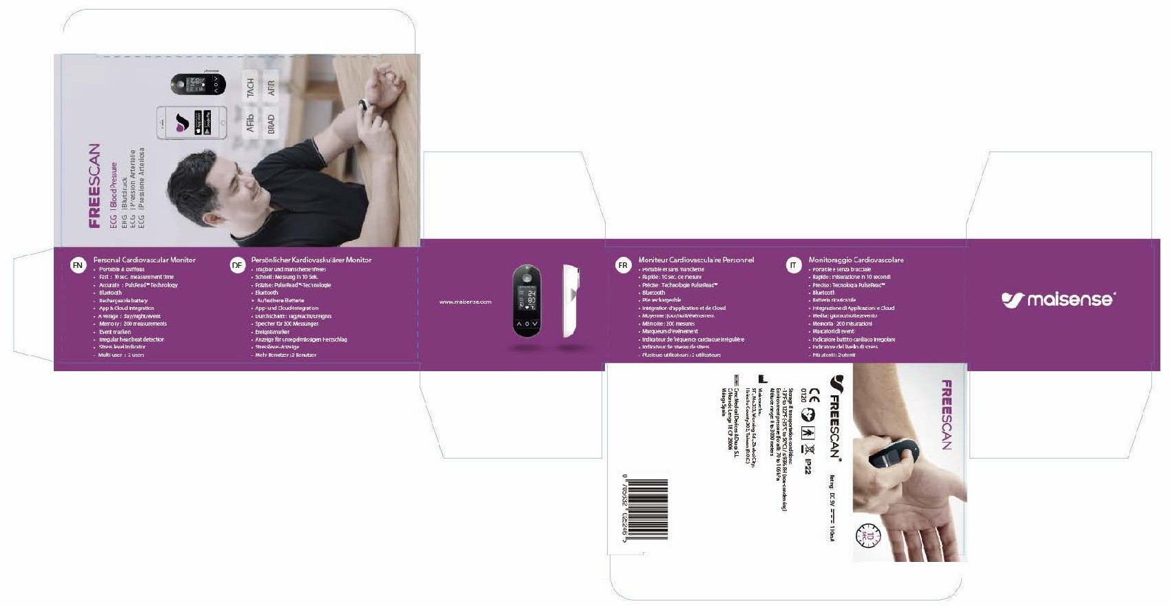
For the Maisense FREESCAN line, the same principle was extended to six language versions (EN / DE / FR / IT / ES / PT) on a single dieline. Layout grids were sized for the longest expected translation (German), with copy zones that could absorb ±15% text length without breaking hierarchy. Regulatory marks (CE, IP rating, recycling, regional barcode) were placed in fixed coordinates so that swapping language packs did not require re-engineering the layout.
Cross-functional collaboration
A packaging file is approved by more people than any UI screen. The decision flow involved PM (positioning, copy, regulatory content), procurement (material part numbers, vendor capability, cost), the print vendor (dieline feasibility, color matching, MOQ), and QA (label content accuracy, regulatory mark compliance).
To keep that loop short, three working artifacts were established: a packaging material drawing sheet (the contract with procurement and the print vendor, carrying part number / version / DWG number), a copy & regulatory matrix (the source of truth for PM and QA — every region's certifications, warnings, and translations in one table), and a proof checklist (color matching, registration, die-cut accuracy, varnish coverage — signed off before mass production).
Material part numbers (e.g. 401-001035-02 for the Color Box, 416-000194-00 for the addendum) were filed alongside the design files so procurement could reorder without re-opening the design loop. This is the unglamorous half of the work that makes packaging actually ship.
Outcome
The packaging system shipped across multiple product lines and went into mass production through external print vendors.
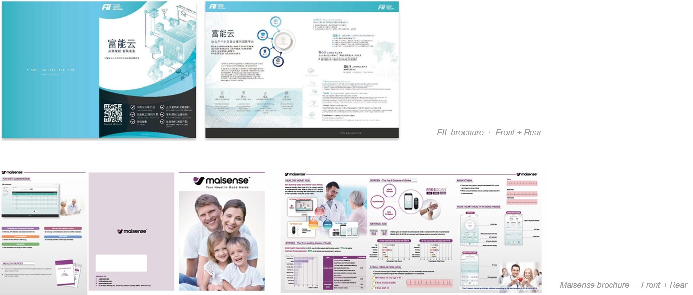
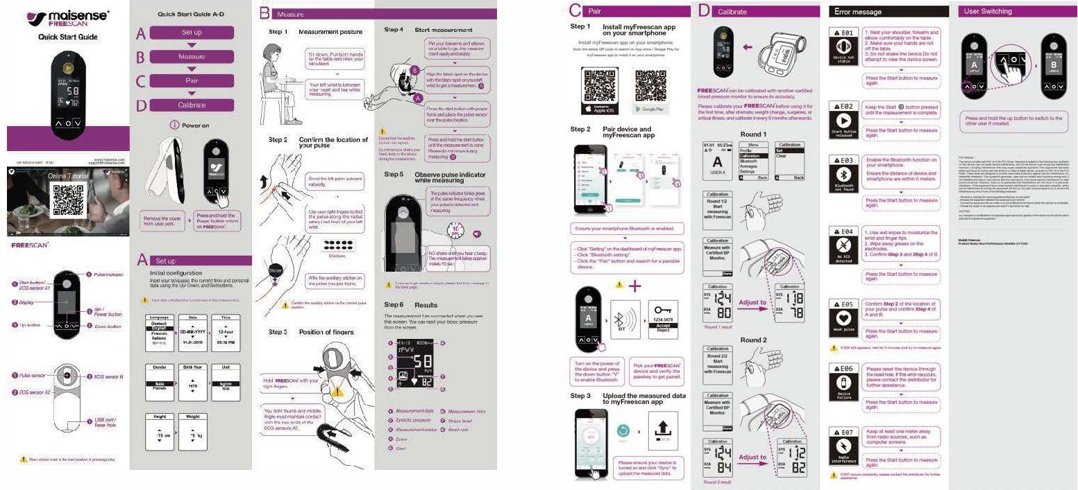
Deliverables included: Color Box dieline & print spec / Cushion insert structural design / Addendum & sticker artwork / Multilingual layout system (6 languages) / Brochure & marketing collateral / Packaging material drawings with part numbers for procurement / Cross-functional review checklists.
The visual system continues to absorb new SKUs without structural redesign — a sign that the grammar, not just the artwork, was the deliverable.

What's next?
Full case study materials including dielines, print specifications, material part number references, and cross-functional collaboration artifacts are available upon request.
For collaboration or interview opportunities, feel free to contact me via email or LinkedIn. contact@yasminalin.com.tw