
Maisense Health Report
From 41-page Report to 1-page Dashboard.
Healthcare UX / Information Architecture / Data Visualization
Project details
Maisense Healthy Heart Hub is a remote cardiovascular monitoring solution. The original monthly report was 41 pages long — too dense for patients to read, too complex for doctors to explain within consultation time. This project redesigned the report's information architecture so the same dataset could serve both audiences.
Role
UI/UX Designer
Status
Shipped
Year
2017 — 2018
Context
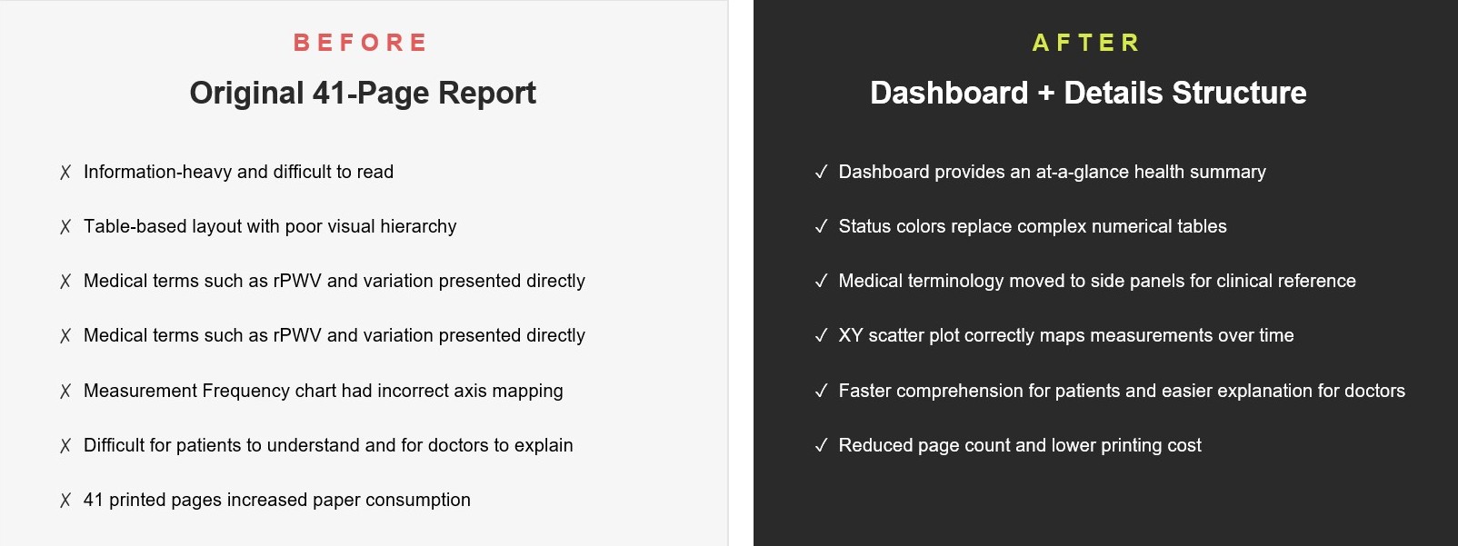
Maisense Healthy Heart Hub generates monthly cardiovascular reports covering blood pressure, arterial stiffness (rPWV), AFib burden, and measurement frequency. The original 41-page document was built for clinical archiving — not for human reading.
Two audiences had to share the same report: patients trying to understand their own health, and doctors trying to explain it within a short consultation window. Neither was well served.
The core challenge was redesigning the information architecture so that the same dataset could deliver two reading paths — a quick visual overview for patients, and a detailed clinical reference for doctors — within a print-ready PDF format with no interactive elements available.
Constraints & Decisions
The redesign had to work within four hard boundaries: dual users (patient + doctor), print-ready PDF (no interaction), medical data fidelity (rPWV / SYS / DIA / AFib burden across 1 / 3 / 12-month ranges), and a reduced printed page count for sustainability.
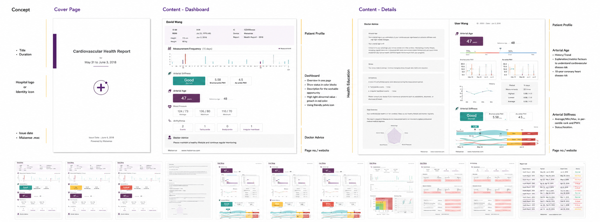
Key design decisions: restructure 41 linear pages into a three-layer architecture — Cover / Dashboard / Details — so a one-page overview anchors the report and raw data is collapsed into appendix layers. Replace numeric tables with Good / Alert / Critical status colors so patients see "how am I doing" before "what is rPWV." Preserve medical terminology in a sidebar reserved for clinical explanation, keeping the main view in icon-led visual language for patients. Redesign the Measurement Frequency chart as an XY scatter plot (X = count, Y = date) to fix the original axis misalignment.
Trade-off:
Information density vs. comprehension speed — complete data could not be abandoned for clinical and regulatory reasons. The resolution was layering rather than removal: Dashboard surfaces what matters most at first glance, while Details preserve full data fidelity behind it. The same report supports two reading speeds without sacrificing either.
Outcome
The redesigned report shipped as Maisense's standard monthly deliverable, alongside a full UI Guideline that became the visual foundation for downstream report types and the myFreescan companion app.
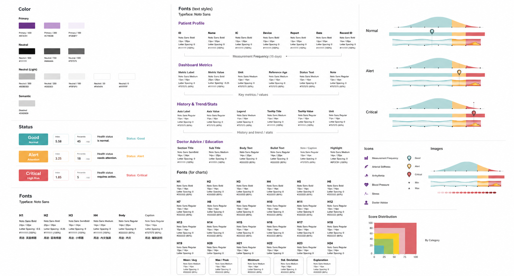
Deliverables included: Cover / Dashboard / Details three-layer report system / Good–Alert–Critical status color semantics / patient-facing icon language + doctor-facing terminology sidebar / redesigned Measurement Frequency chart with corrected axis logic / complete UI Guideline (Color / Status / Fonts / Icons / Charts / Images) / Brochure / Flyer / Package / Product Manual for the wider Maisense product line.
Patients gained a 1-minute readable overview. Doctors gained a Dashboard they could point to during consultations. Printed page count dropped substantially. "Easy to read for patients, easy to explain for doctors" — same data, two reading paths.
What's next?
Full case study materials including the original 41-page report audit, information architecture diagrams, UI Guideline, and the myFreescan App redesign are available upon request.
For collaboration or interview opportunities, feel free to contact me via email or LinkedIn. contact@yasminalin.com.tw